projects

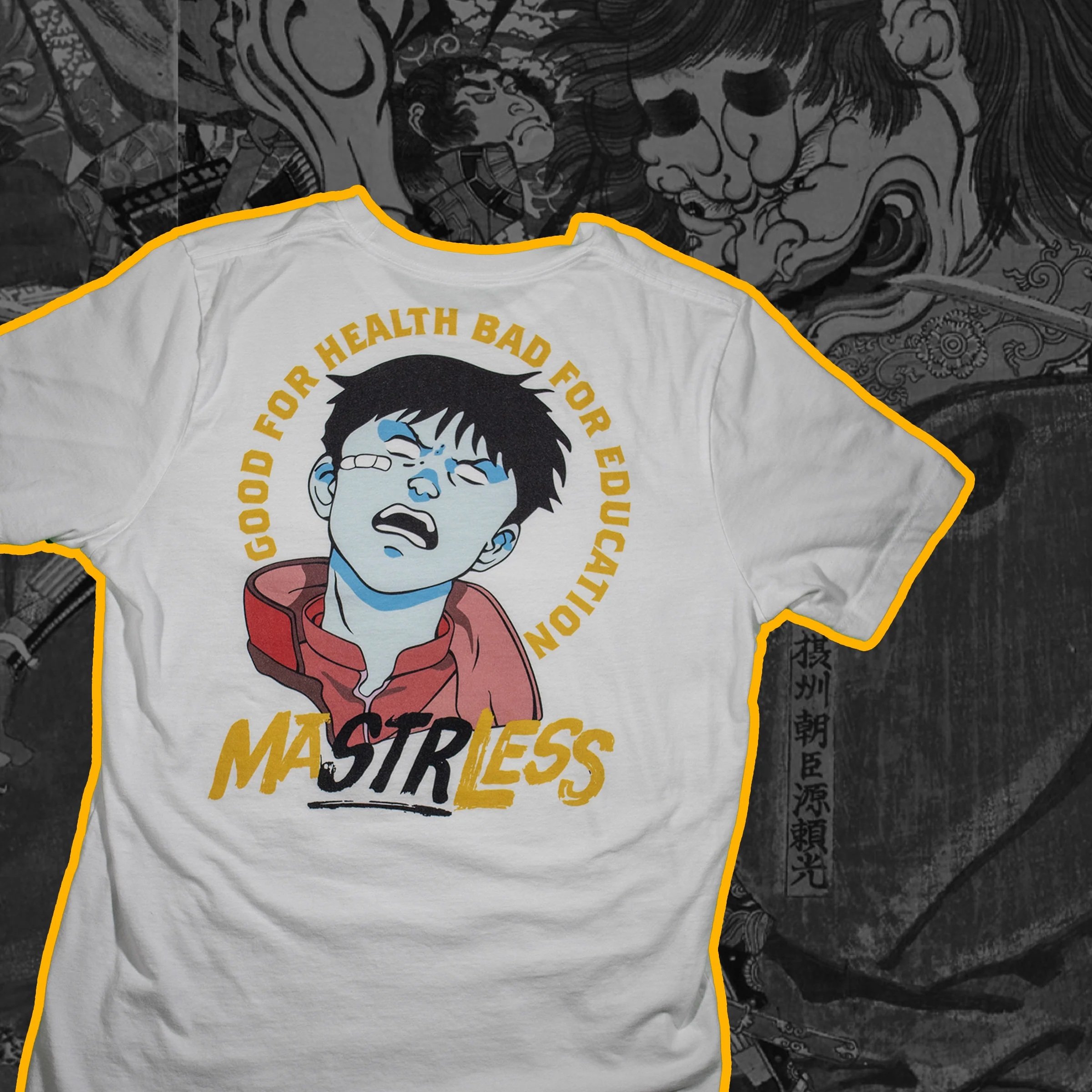


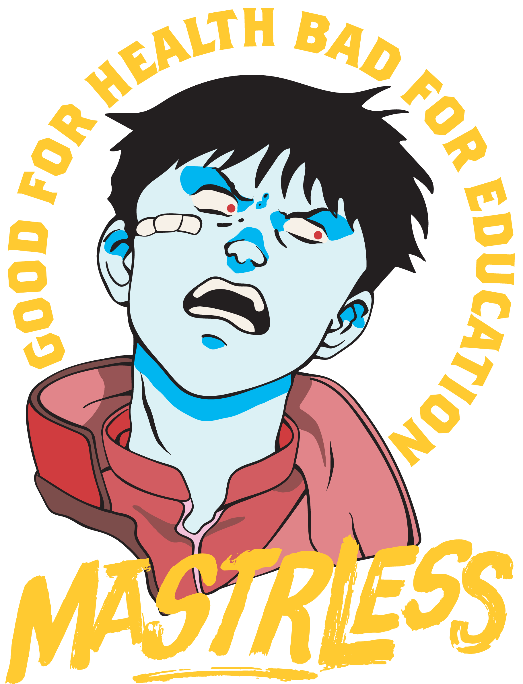
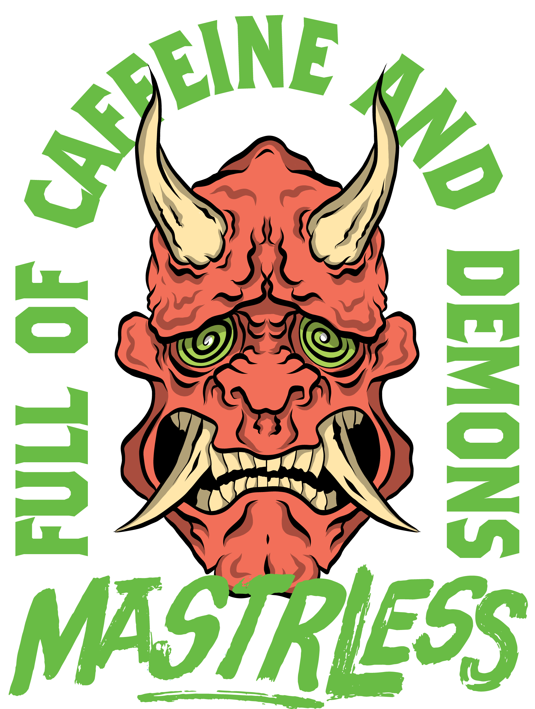
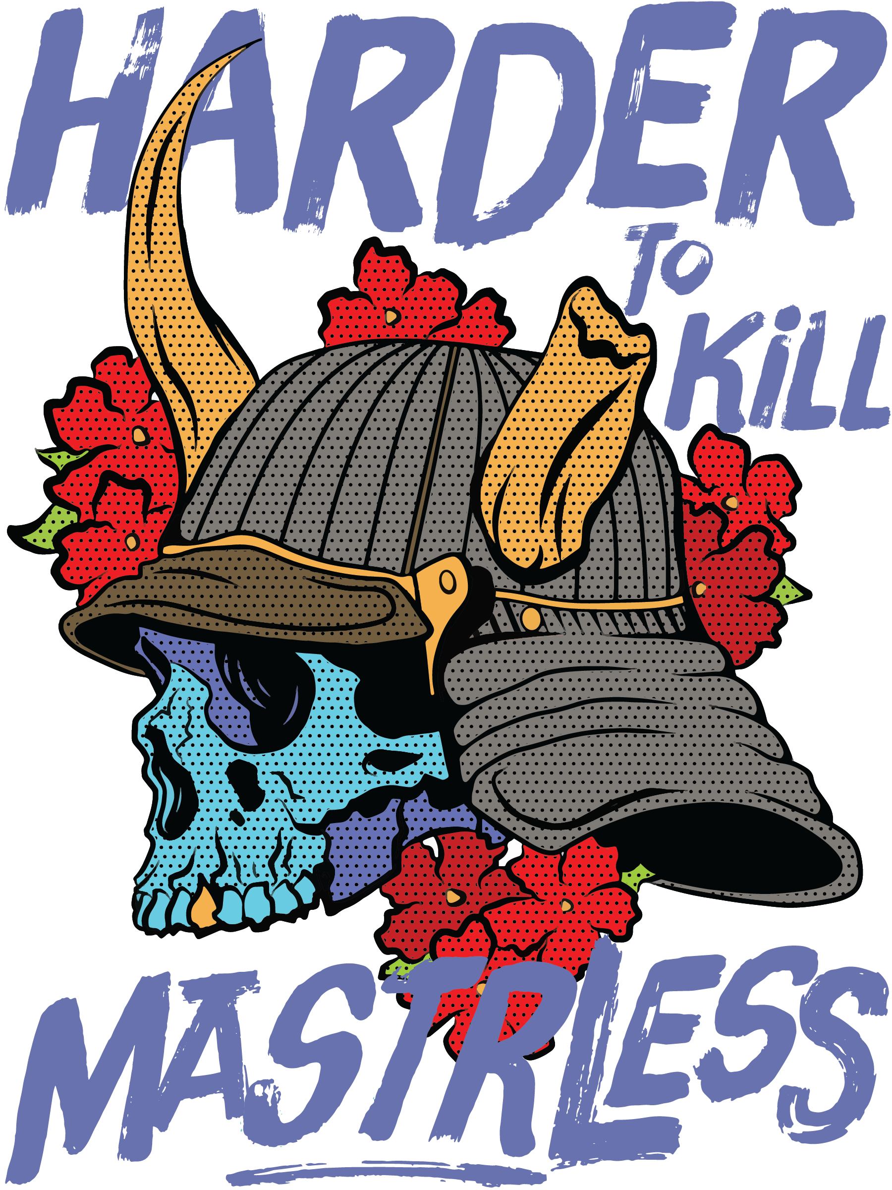
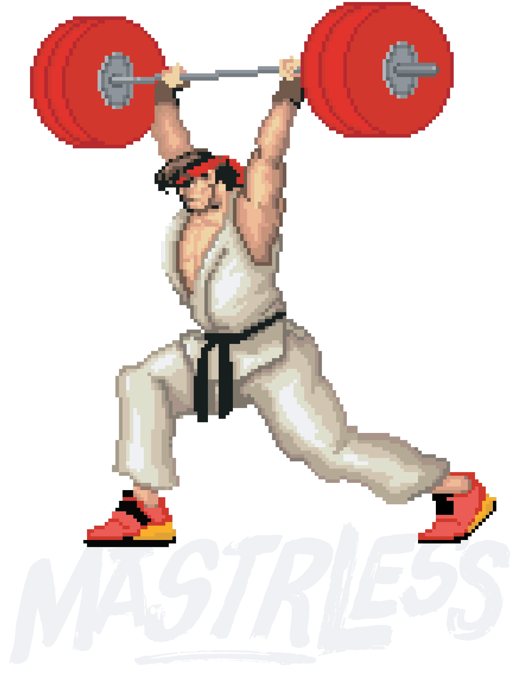
Mastrless has been a passion project of mine for the past few years. Originally launched as Barbell Bushido, it has evolved into a fitness and streetwear brand that I’ve developed on and off over time. The name Mastrless is inspired by the masterless samurai, or ronin, who wandered as mercenaries. I adjusted the spelling to include “STR,” the common abbreviation for strength, to emphasize the brand’s connection to athletes and gym culture.
The identity of Mastrless draws from a wide range of influences, blending traditional ukiyo-e painting and bushido culture with the raw energy of 1970s exploitation films and the rebellious edge of punk rock. At the core of the brand is the concept of “champloo,” a word that refers to a stir-fry dish where different elements are mixed together. In this case, the elements are not ingredients but cultural influences, brought together to create a unique and expressive aesthetic.


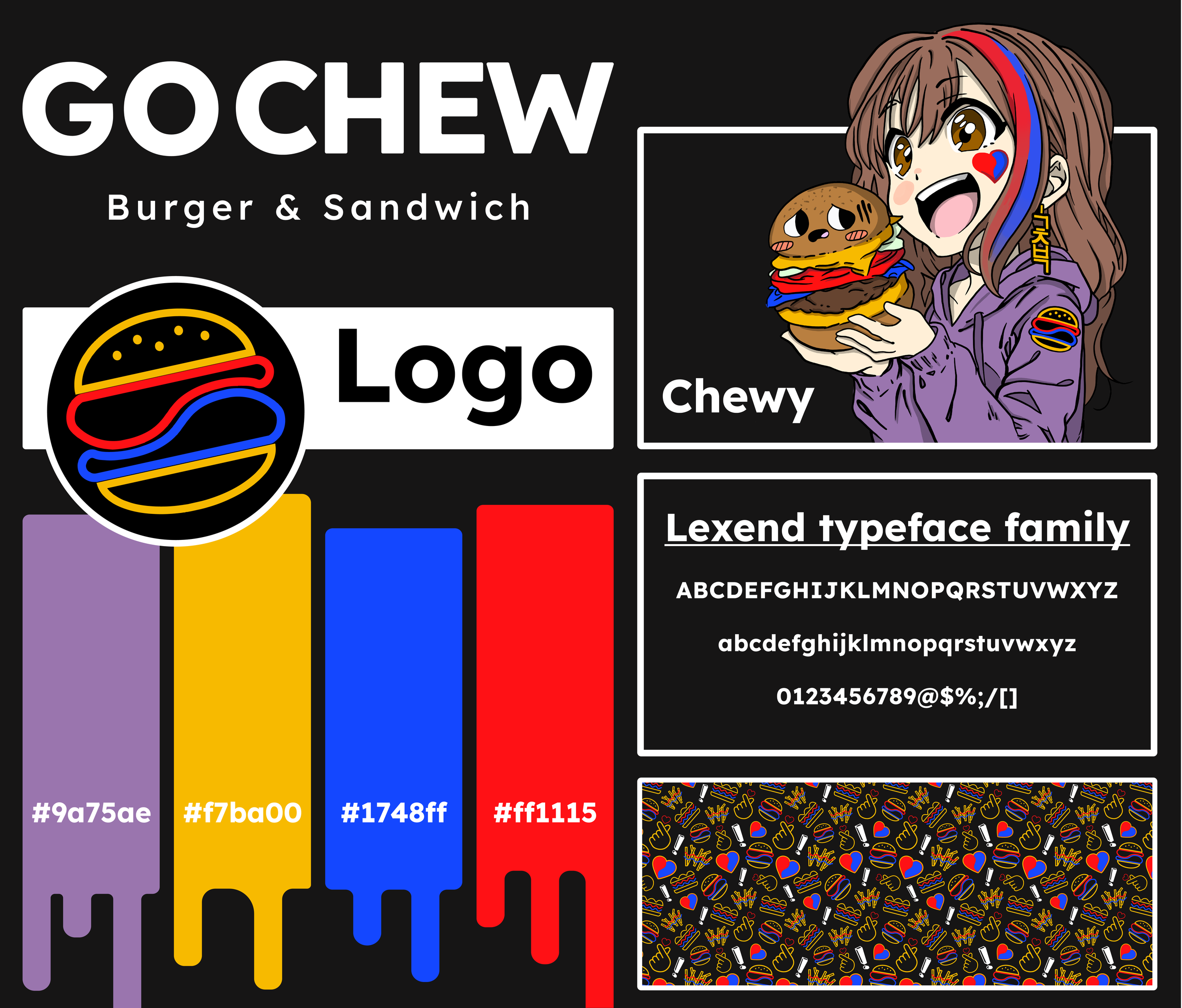
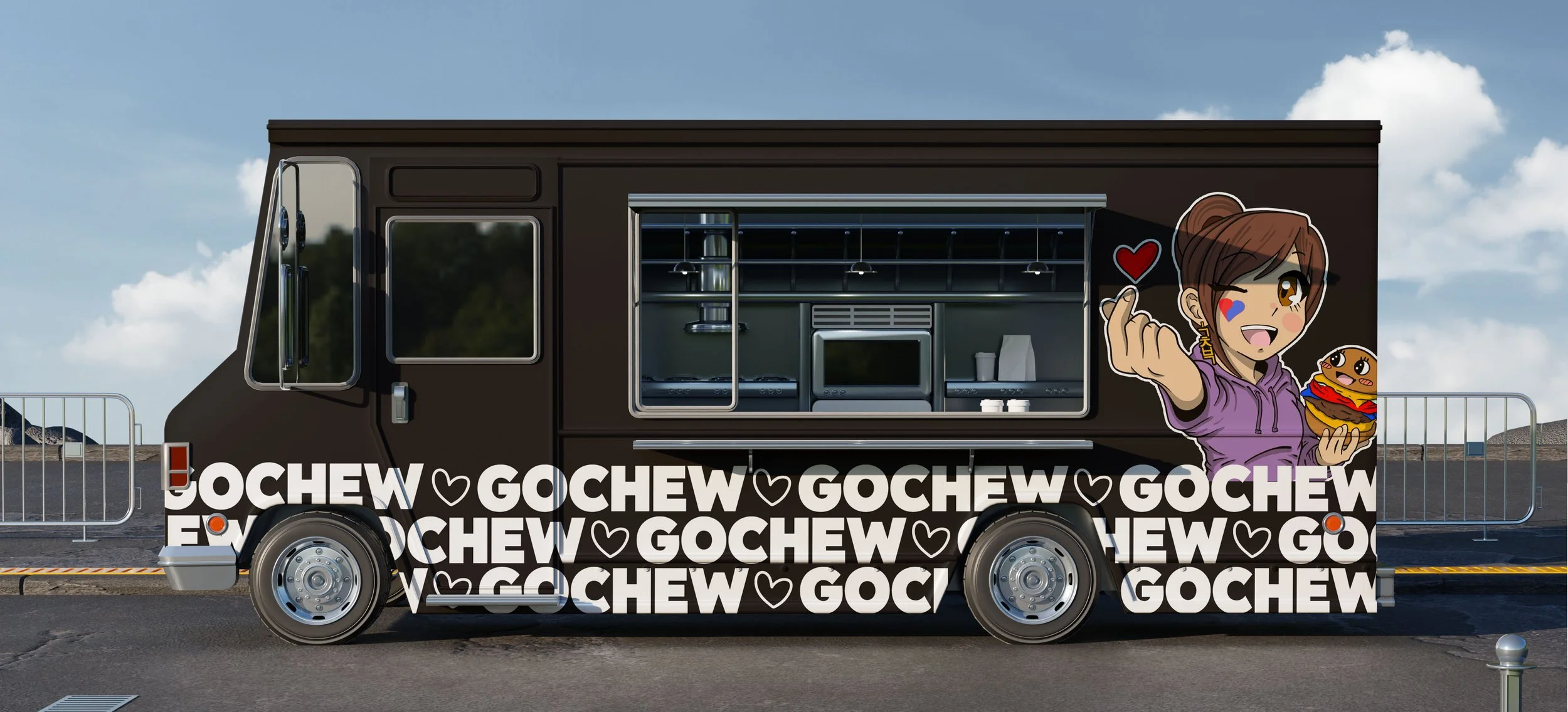

Go Chew is a Korean-owned, Kansas City–based food truck that serves classic American burgers and fries with an Asian twist. I worked with the company to refine and strengthen their brand identity, focusing on creating a look that would stand out and connect with a younger audience. The owner had already established certain fonts and colors, so my role was to refine and organize these elements while expanding on them to build a more cohesive and engaging system.
Together, we developed a vibrant and playful visual identity that highlighted both the Asian influence of the food and the cultural interests of their target audience, particularly fans of anime, video games, and comic books. A central part of this process was the creation of “Chewy,” a mascot who became the face of the brand, along with a cast of anthropomorphized characters made from burgers, fries, and sauce bottles who served as his friends. To reinforce the theme, much of the imagery incorporated anime-inspired or pixelated design styles. We also created unique symbols and icons to further distinguish the brand, including a heart symbol derived from the Korean flag that communicates values such as love, positivity, and friendship.
The end result was a bold and cohesive brand identity that reflects Go Chew’s cultural roots while capturing the fun, energetic spirit of its food.
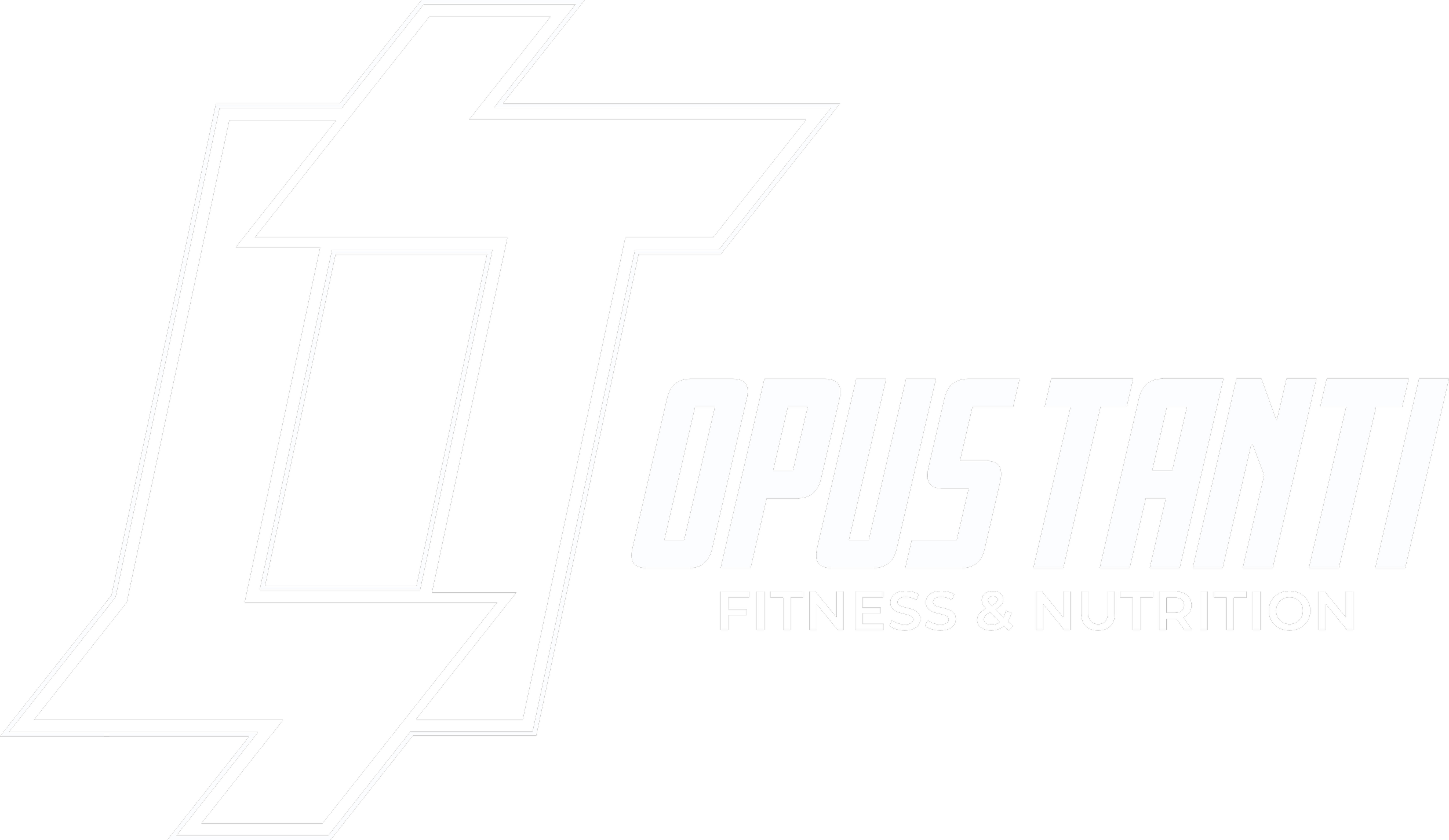
Opus Tanti is an online private practice offering fitness and nutrition coaching. I worked closely with the client to develop their logo, branding, and overall visual identity, making sure each element aligned with their vision for the brand.
The client wanted a monogram-style logo that incorporated the equilibrium arrow from chemistry. I translated this into an “OT” mark with opposing arrows, creating a symbol that reflects balance and reinforces the brand’s connection to science and performance.
Beyond the logo and identity system, I designed a range of print assets including banners, business cards, and brochures to support both digital and in-person use.
I also designed and built the website, focusing on clarity, usability, and a seamless user experience. As part of this process, I guided the client through managing the site on the backend using CMS software, ensuring they could confidently make updates on their own. I helped them select a fitness and nutrition CRM and integrated it into the website to streamline their services and client experience.
I’m currently continuing work with the client, integrating insurance and EHR systems into the website and overall business to further expand functionality before launch.


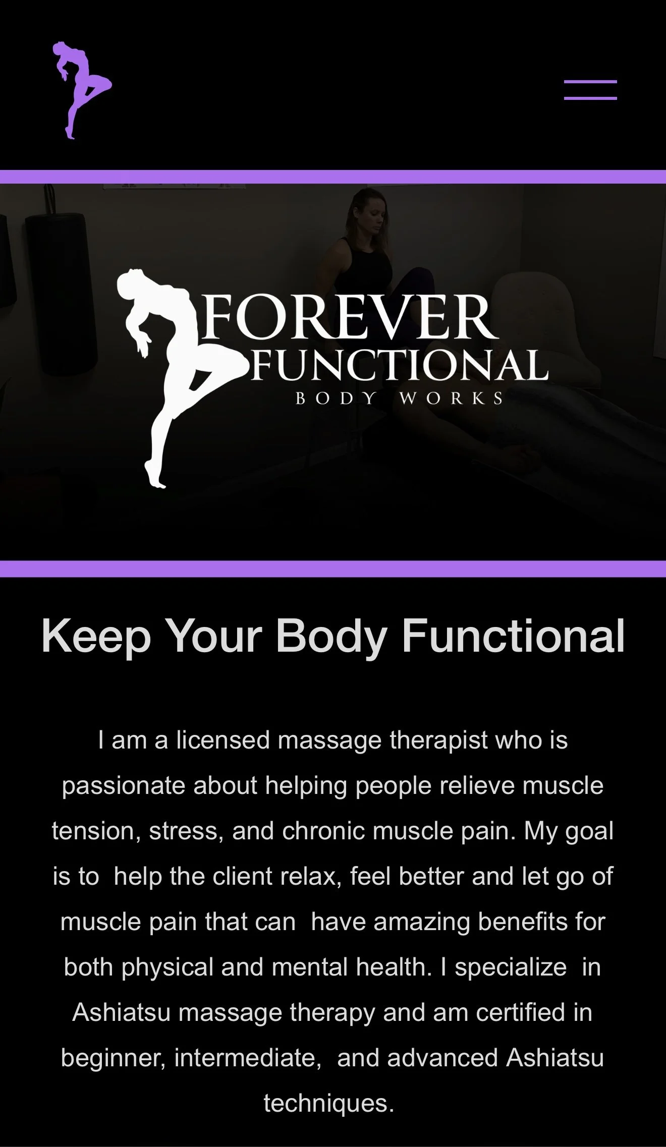
Forever Functional was a client who needed their website redone for a massage therapy business. After reviewing their current website and branding I suggested that they let me rebrand their business, by selecting some fonts, colors, and creating a logo for them. They were on a small budget and tight timeline. So I agreed to do this for cheap and keep things very simple, which aligned with their needs as a business and the preferences of the audience they were trying to reach. We decided on an off white, charcoal black, and lavender color to keep things simple, and easy to implement, with high contrast ratios regardless of the color combination. We picked an elegant serif font for their word mark, and simple, easy to read sans-serif font for their website and body text. Lastly I took and idea the owner head for a long and simplified into a silhouette of a woman to create their logo.
Using these elements I used Squarespace to build them a very simple and easy to navigate webpage that functioned well both on desktop and screens. Once this was done we transferred the domain from the old website to the new one, and the client took control of the page.
school projects
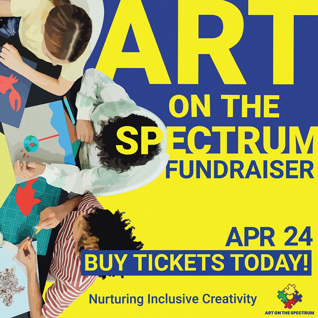
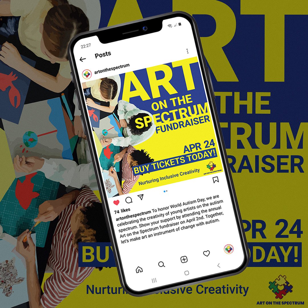
Social media post for Art on the Spectrum Fundraiser
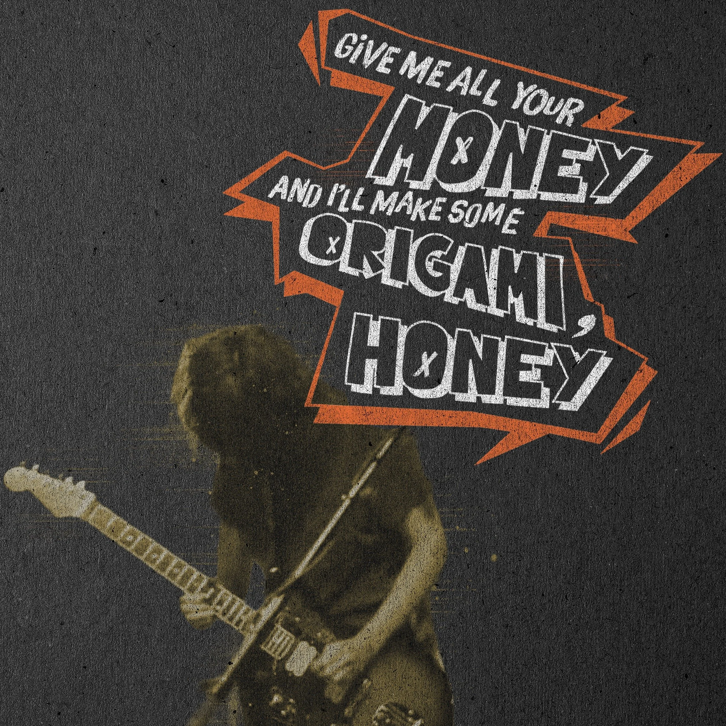
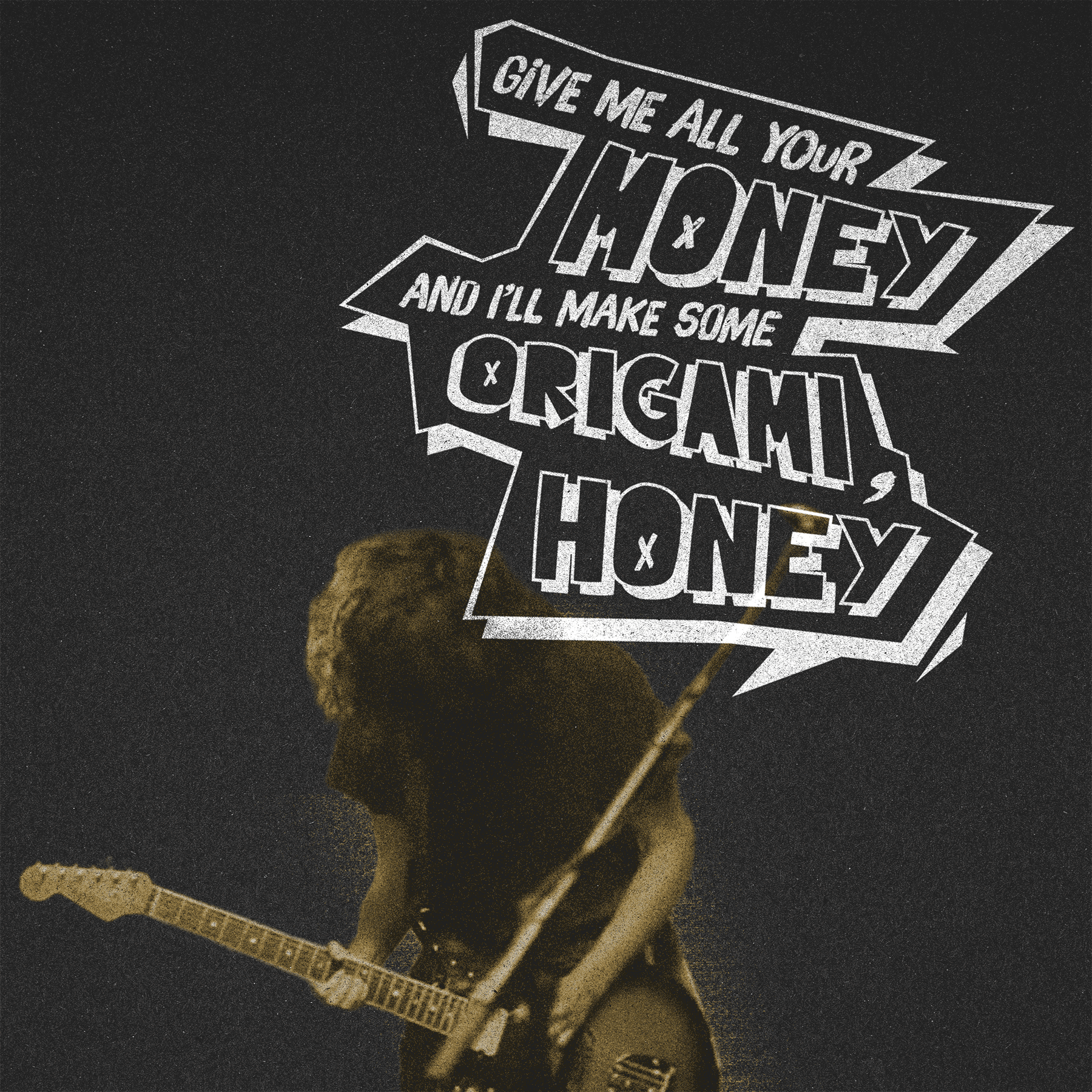
Social media posts for musician Courtney barnett
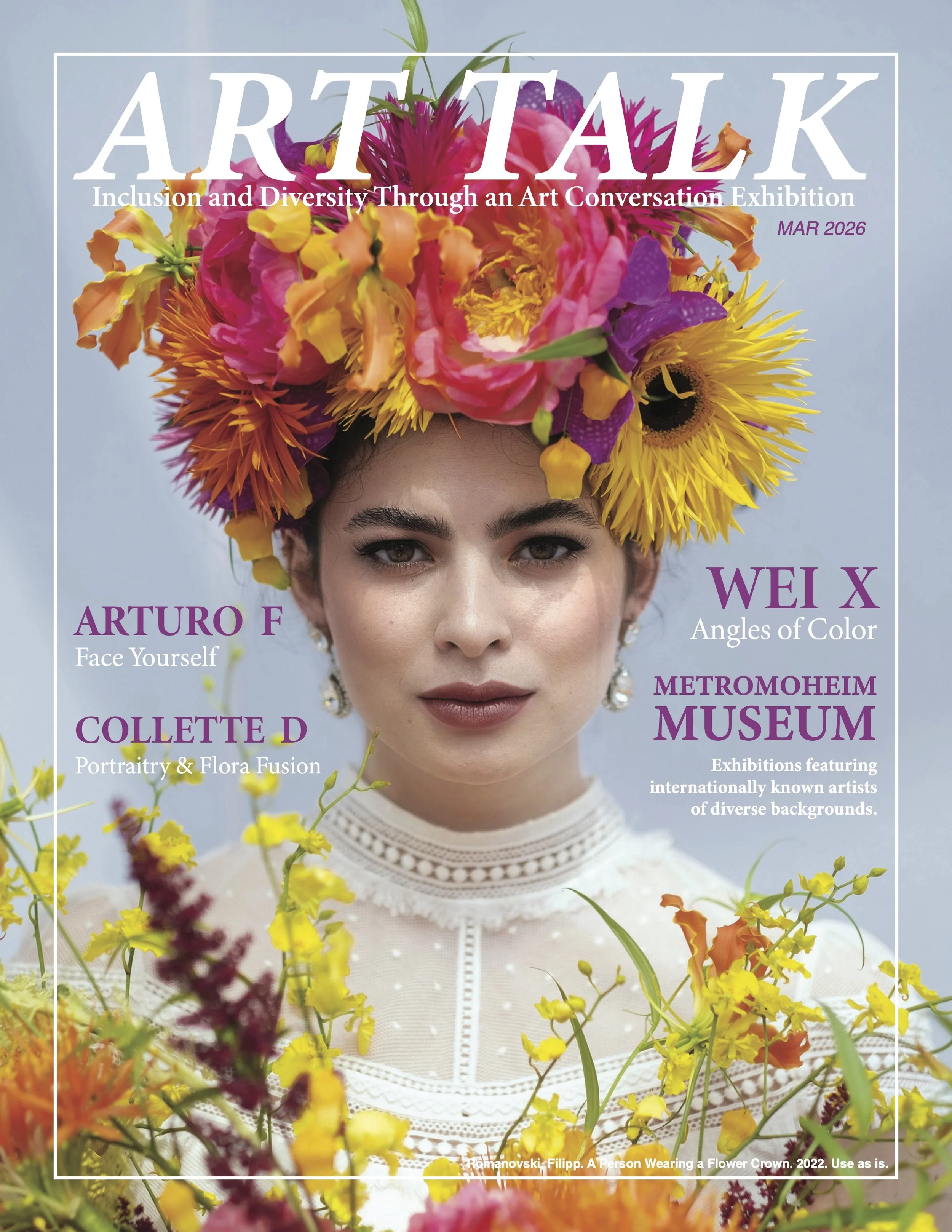
magazine cover and spread for art talk art exhibit
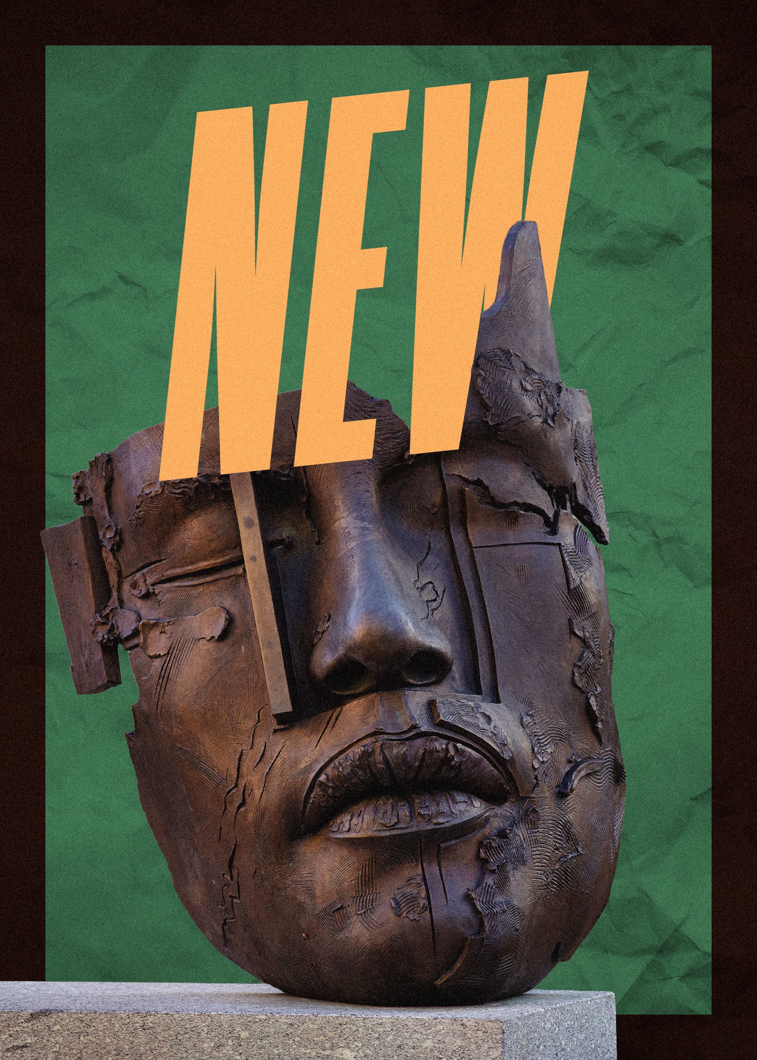
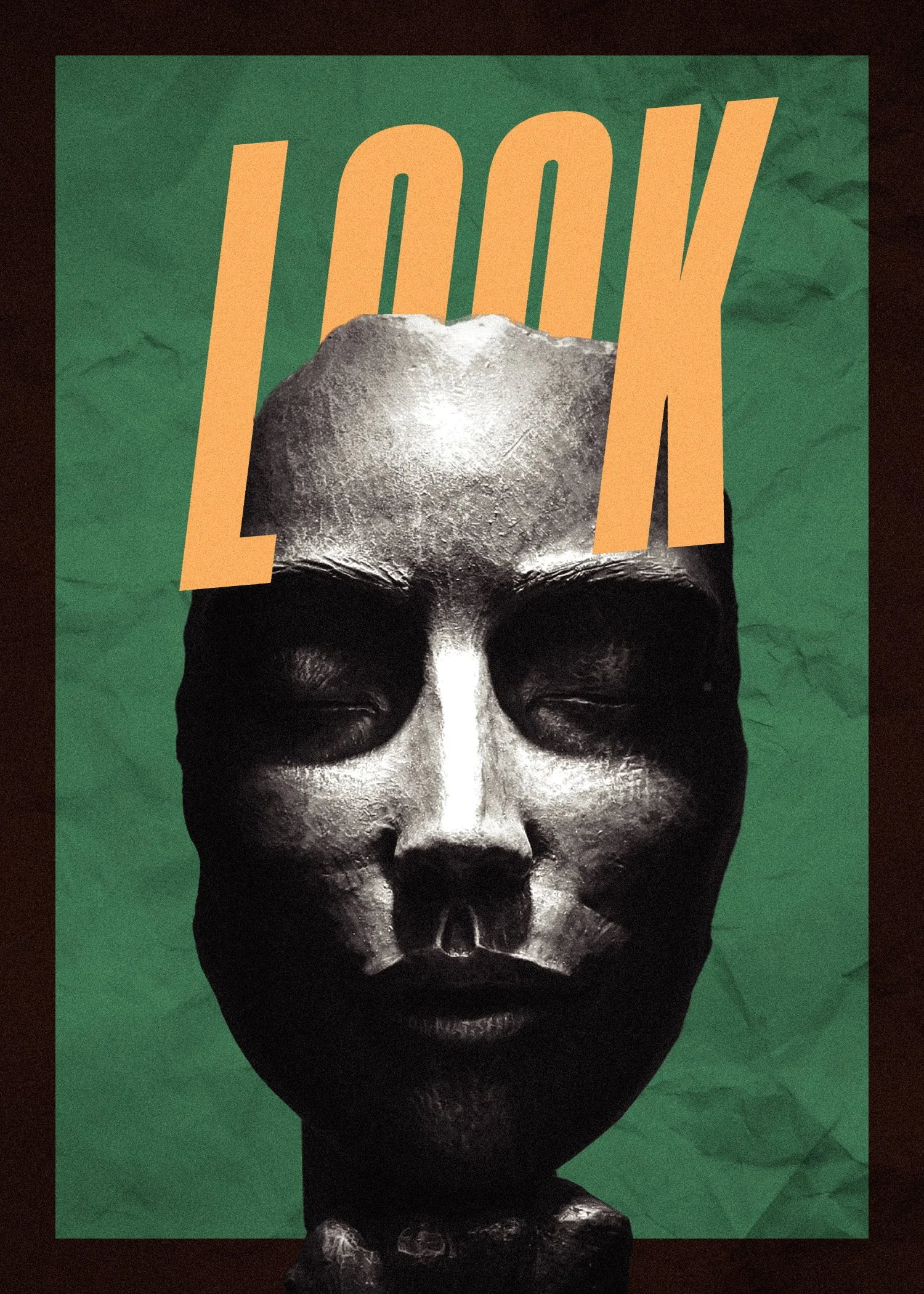
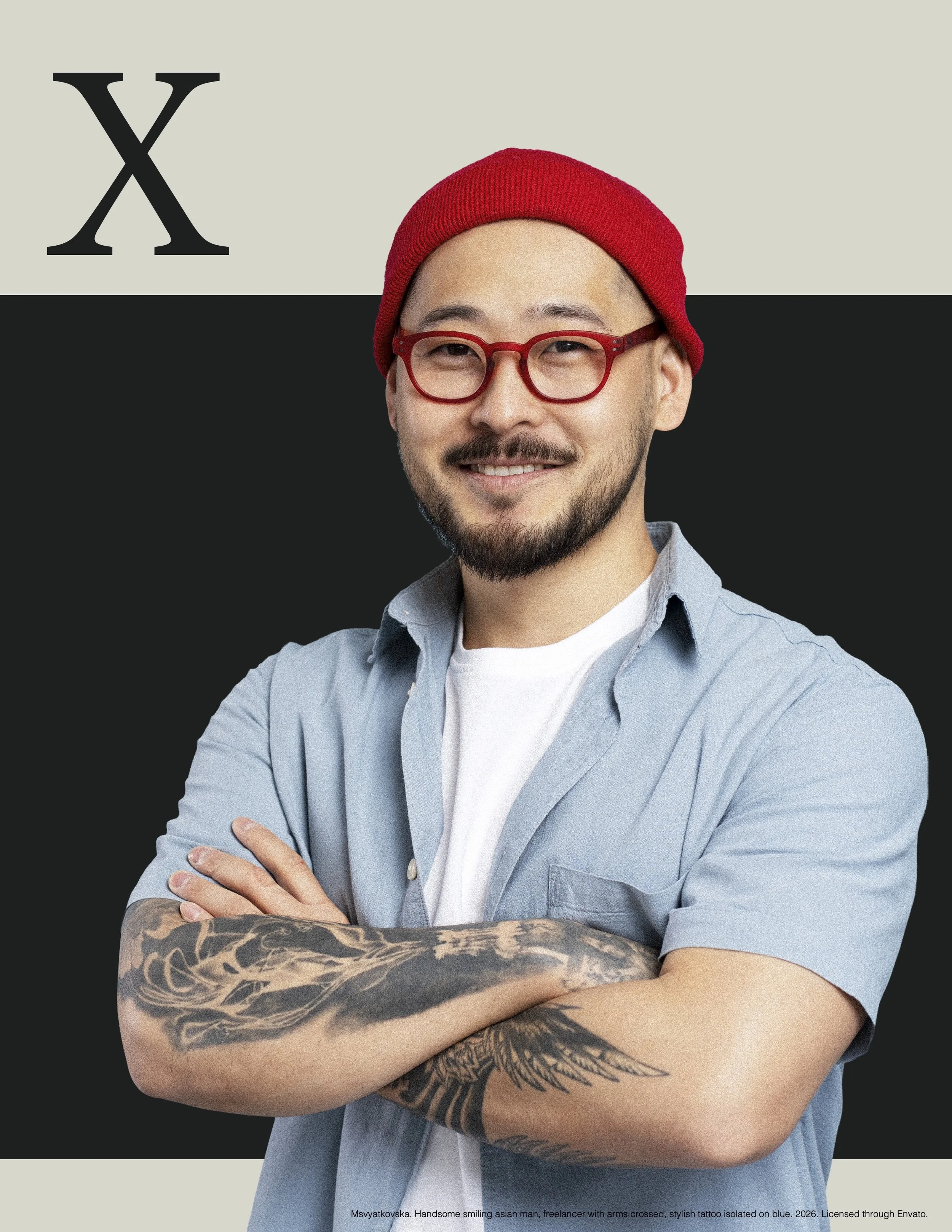
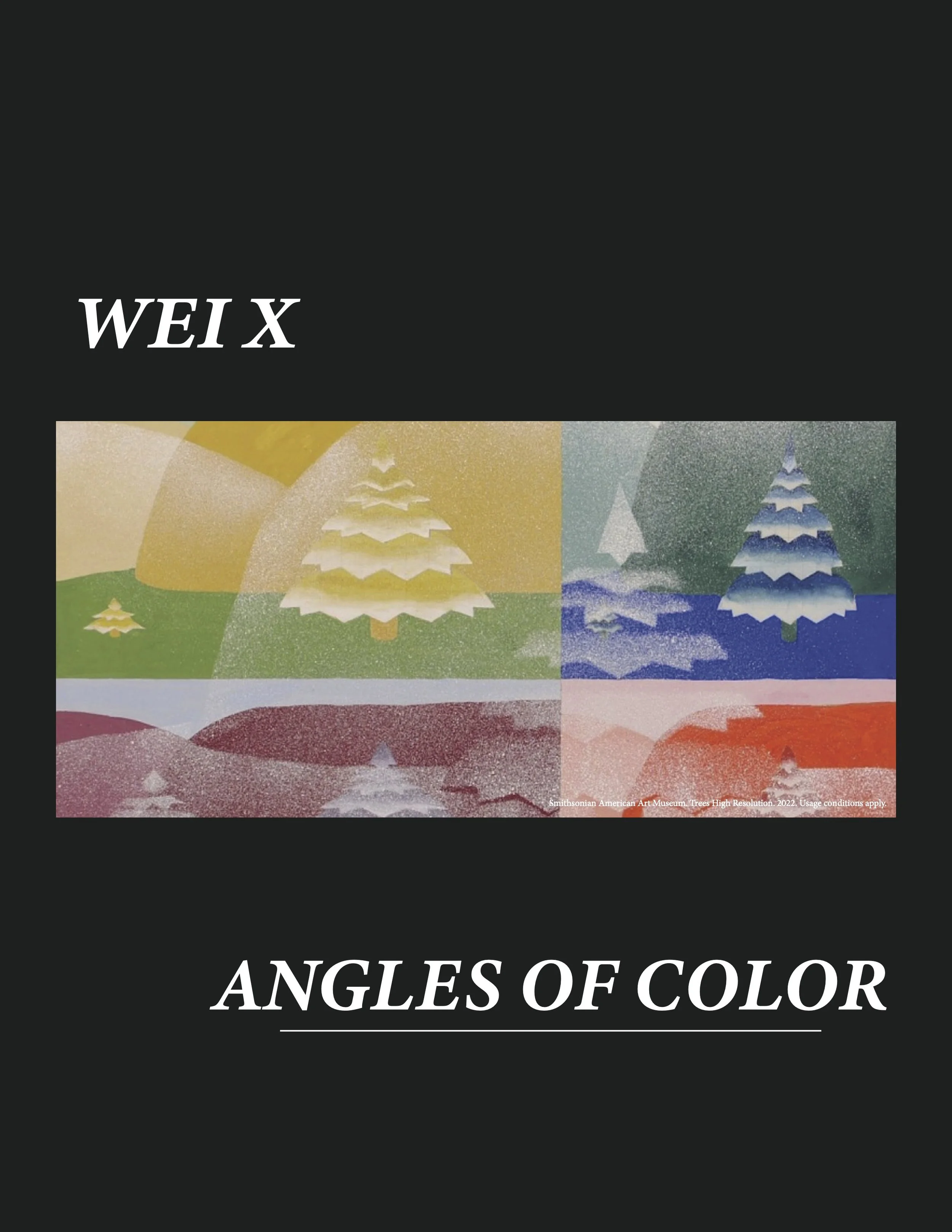
poster series for metromoheim museum new year exhibit
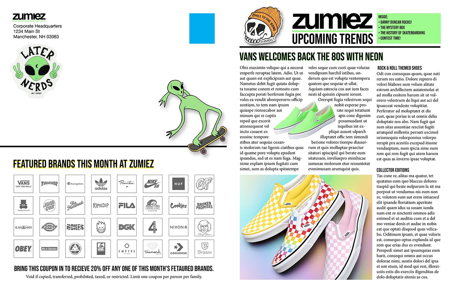
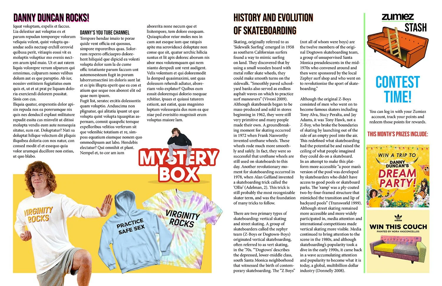
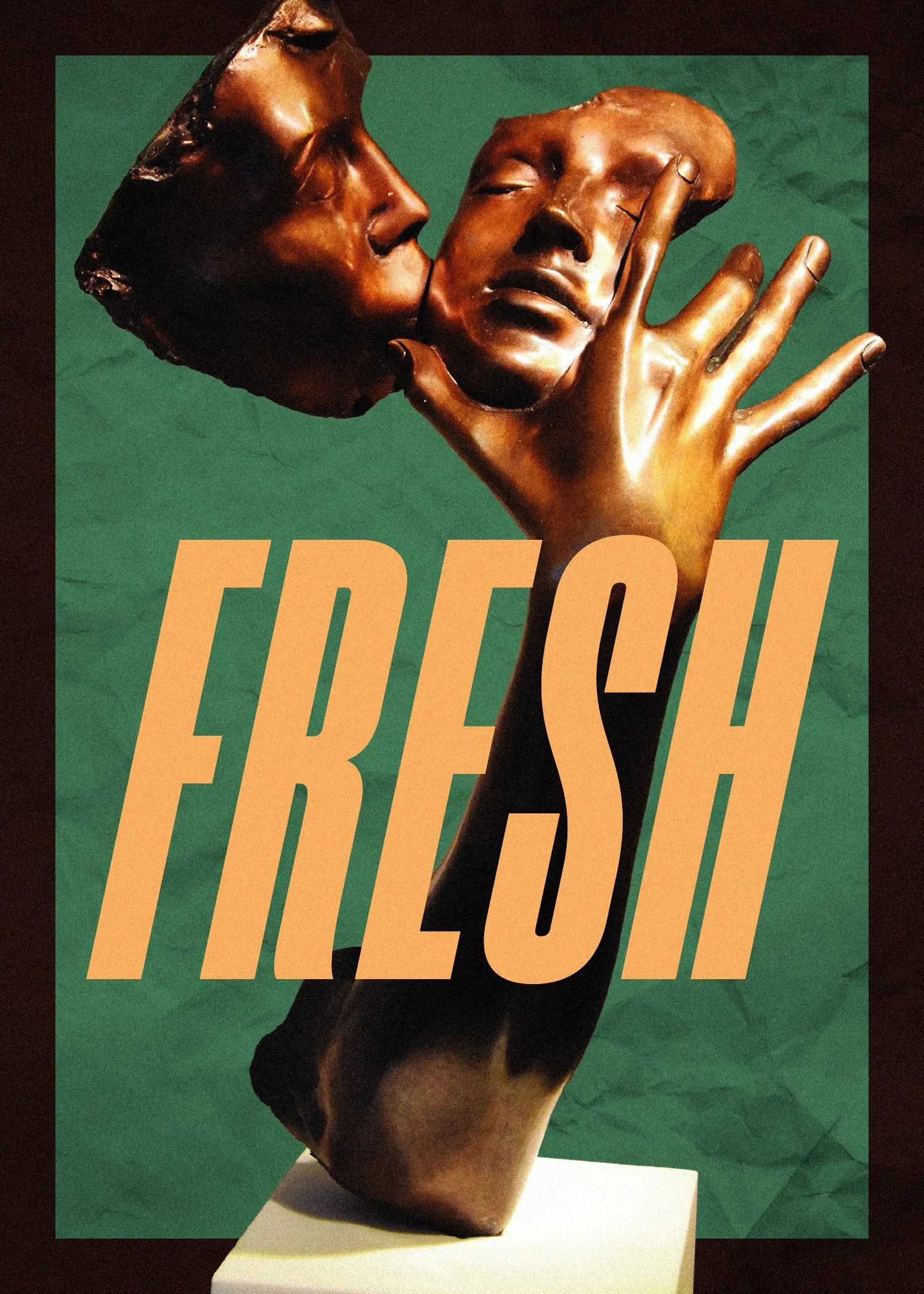
zumiez magazine spread