
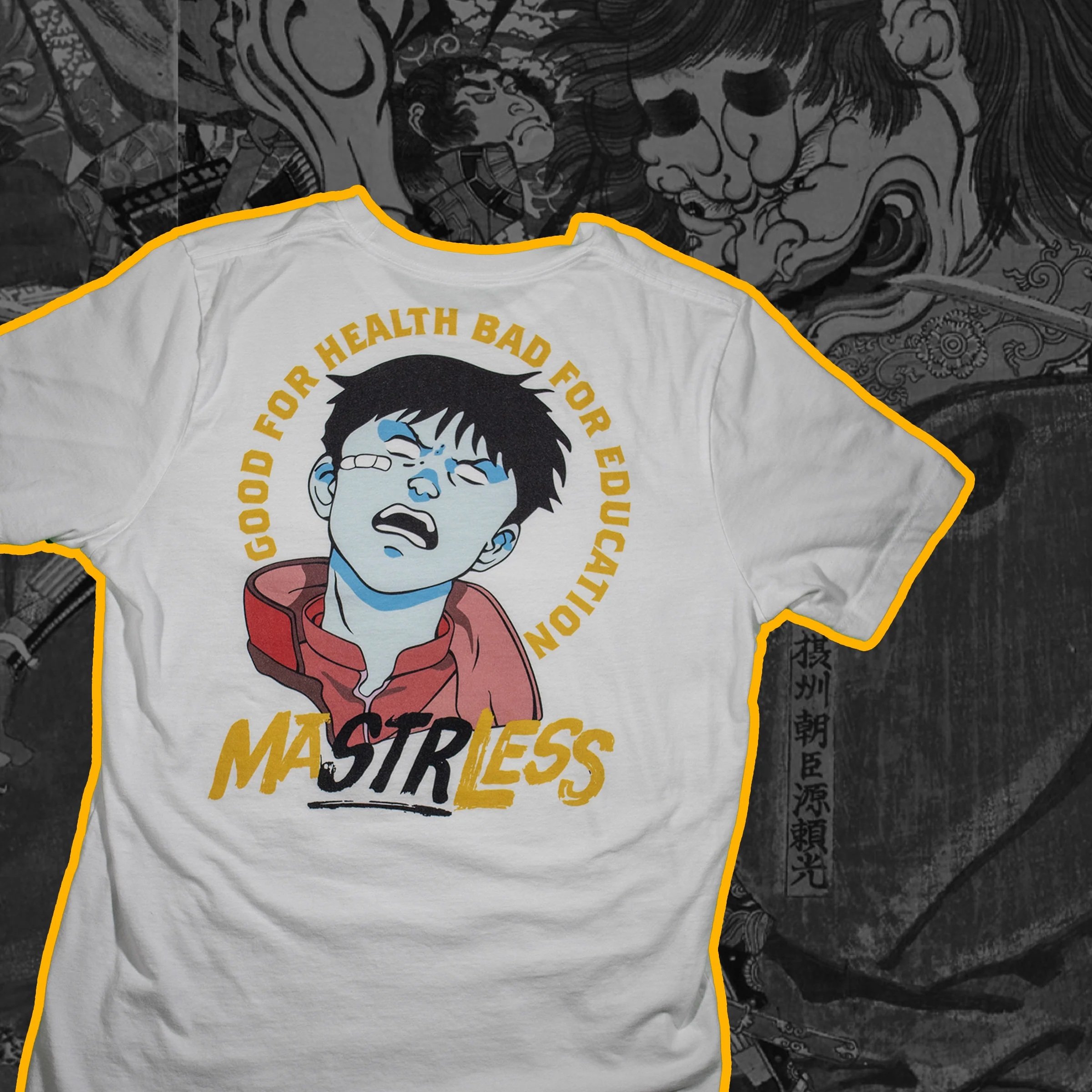


Mastrless has been a passion project of mine for the past few years. Originally launched as Barbell Bushido, it has evolved into a fitness and streetwear brand that I’ve developed on and off over time. The name Mastrless is inspired by the masterless samurai, or ronin, who wandered as mercenaries. I adjusted the spelling to include “STR,” the common abbreviation for strength, to emphasize the brand’s connection to athletes and gym culture.
The identity of Mastrless draws from a wide range of influences, blending traditional ukiyo-e painting and bushido culture with the raw energy of 1970s exploitation films and the rebellious edge of punk rock. At the core of the brand is the concept of “champloo,” a word that refers to a stir-fry dish where different elements are mixed together. In this case, the elements are not ingredients but cultural influences, brought together to create a unique and expressive aesthetic.


Go Chew is a Korean-owned, Kansas City–based food truck that serves classic American burgers and fries with an Asian twist. I worked with the company to refine and strengthen their brand identity, focusing on creating a look that would stand out and connect with a younger audience. The owner had already established certain fonts and colors, so my role was to refine and organize these elements while expanding on them to build a more cohesive and engaging system.
Together, we developed a vibrant and playful visual identity that highlighted both the Asian influence of the food and the cultural interests of their target audience, particularly fans of anime, video games, and comic books. A central part of this process was the creation of “Chewy,” a mascot who became the face of the brand, along with a cast of anthropomorphized characters made from burgers, fries, and sauce bottles who served as his friends. To reinforce the theme, much of the imagery incorporated anime-inspired or pixelated design styles. We also created unique symbols and icons to further distinguish the brand, including a heart symbol derived from the Korean flag that communicates values such as love, positivity, and friendship.
The end result was a bold and cohesive brand identity that reflects Go Chew’s cultural roots while capturing the fun, energetic spirit of its food.


Forever Functional was a client who needed their website redone for a massage therapy business. After reviewing their current website and branding I suggested that they let me rebrand their business, by selecting some fonts, colors, and creating a logo for them. They were on a small budget and tight timeline. So I agreed to do this for cheap and keep things very simple, which aligned with their needs as a business and the preferences of the audience they were trying to reach. We decided on an off white, charcoal black, and lavender color to keep things simple, and easy to implement, with high contrast ratios regardless of the color combination. We picked an elegant serif font for their word mark, and simple, easy to read sans-serif font for their website and body text. Lastly I took and idea the owner head for a long and simplified into a silhouette of a woman to create their logo.
Using these elements I used Squarespace to build them a very simple and easy to navigate webpage that functioned well both on desktop and screens. Once this was done we transferred the domain from the old website to the new one, and the client took control of the page.
SCHOOL PROJECTS


For this project, I looked at Focus 05, a fictional restaurant in Soho that set out to attract a millennial audience but found its branding was instead drawing in an older, more conservative crowd. Since their main advertising is through subway interior car cards across from a major station, I focused on analyzing why those ads weren’t resonating with the intended demographic. The problem was already clear—there was a disconnect between the brand’s mission and the way it was being visually communicated—so my role was to rethink the design direction and develop solutions that better align the ads with the millennial market the restaurant wants to reach.
Building on that analysis, I began developing design solutions by focusing on imagery, color, and typography that better reflect millennial preferences. Research shows millennials are drawn to visuals that are bold, quirky, exotic, and that emphasize community and diversity. With this in mind, I selected images that highlight novelty and social interaction—scenes of friends together, vibrant outdoor environments, and even colorful architecture that subtly conveys a sense of shared experience. Many of these images are set in warmer, tropical climates, which not only create an adventurous feel but also appeal to millennials’ environmentally conscious and active lifestyles. I also incorporated a playful image of a dog in a beanie, which speaks to both humor and identity, given that pet ownership is a significant part of millennial culture.
For the color palette, I drew directly from the chosen imagery to keep the aesthetic consistent and authentic. The palette references natural tones found in exotic outdoor settings—bright blues reminiscent of water and sky, warm yellows and oranges tied to sunlight, and pinks and maroons inspired by sunset phases. I increased saturation slightly to match the millennial preference for vivid, high-energy color, while ensuring combinations maintained adequate contrast for clarity and readability.
Typography followed the same principle of balance between function and personality. I selected Arial and Futura for their modern, clean, and highly readable qualities, ideal for body text across both print and digital media. To avoid a flat or generic look, I added a contrasting display font—Splish Splash—that introduces a playful, adventurous energy without sacrificing readability. This creates a strong visual hierarchy: clean and professional for body text, bold and approachable for headlines or a wordmark-style logo. Together, these choices form a cohesive system that resonates with millennials while staying versatile enough for the brand’s long-term growth.